I love so many individual elements in this sketch: paper strips, triangle, chevrons, and the photo cluster. I repeated these elements in my layout. Here's my take:
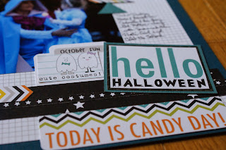
For this layout, I layered a trimmed down sheet of white grid paper from Bella Blvd on top of a blue sheet of plain cardstock. I used several strips and patterned paper pieces from Bella Blvd's "Trick or Treat" Halloween collection to create layers at the bottom of the page. Obviously, I did not follow the sketch exactly. I liked the idea of 4 square photos in the middle of the page - so I focused on that element, cropping my photos to 4x4s and arranging them in the center. You can see that I also used the layered strips idea, but changed the direction and location of them on the page - mostly because my photos are much larger than what the original sketch called for and the strips would have been lost behind the photos, so I created the cluster of elements to the bottom right. Additional elements that I pulled from the sketch include the use of triangles (loving them lately) and the chevron element (represented by the colorful chevron borders I fussy cut and the small file "Today is Candy Day" element). I love how this layout focuses on the photos, yet has plenty of room to highlight awesome papers. Do you enjoy sketches? Check out Creative Scrappers - you still have time to join in the fun!


No comments:
Post a Comment