This is one of my favorites. The photos aren't my best - they are from my iphone, but they are precious to us. These are some of the last photos taken of my daughter and her Umpy Lumpy. I really wanted these sweet photos to be the emphasis of the page and also have enough room to journal our thoughts and memories. The "Hello Life" collection perfectly sets the background and quietly complements the photos. I also brought in some We R sheer metallic gold heart paper and basic brown/gold cardstock in the mini hearts (die cut with my Cricut and TC Sophisticated cartridge) - one on each photo and a few others scattered around.
This clear 3x4 card is one of my favorites, too. I chose to use it alone, but the white lettering looks awesome against a darker background or photo.
I utilized two 3x4 boxes for the journaling, uniting them with the sheer heart paper. I trimmed opposite ends of two identical 3x4 cards to elongate them across the sections and give me more space for journaling. The stamps used in this layout are from Teresa Collins as well (Stationary Noted set).
This next layout is a fun and silly one, but it also relays an important message for my daughter - "Never apologize for being who you are." These silly photos and the large quote card and clear "Don't Be Afraid to Sparkle" cards are perfect for this layout. I love, love, love working with products that are not only beautiful, but inspire me to create layouts that are meaningful and help to drive my journaling.
I used elements from the new "Quoted" and "Hello Life" AME collections as well as pulled in papers, stickers, and enamel dots from TC's "Hello My Name Is" paper collection.
The rich colors in the "Quoted" AME collection really lent themselves well to this next layout featuring fall photos of our new puppy, Zoe. I cut apart and layered some of the elements from the cards (cute camera!) to create the top row title which I carried across into the next photo pocket. Here I layered some TC tiny alpha stickers directly on top of my photo and added a heart fussy cut from another of the cards.
In the middle row, I found some coordinating We R cardstock and created a die cut title using the TC Sophisticated fancy framed font. Using Cricut Craft Room, I stretched and resized the letters a bit so that they would use up the entire 3x4 pocket. I love how they look paired with the acetate cards behind them.
On the bottom row, I added a card for journaling, an appropriate quote card, and some more fun pattern to a photo, tying it together with a bit of washi across the bottom.
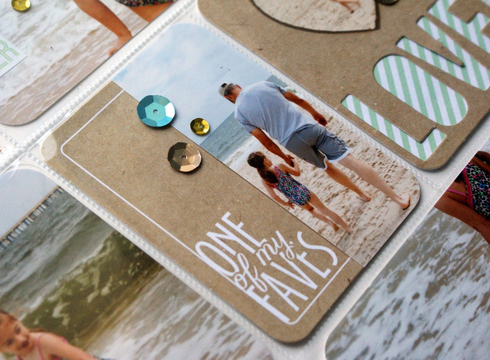
 This last layout is another favorite. The cards in the "Snapshots" collection are just perfect with these beach photos from last summer. I'm a big fan of kraft and love the mint green against it. The clear 4x6 card with the subtle white circles was perfect for my title card. I cut out letters from an actual photo (font is TC Sophisticated) as well as added real sand to the bottom. For this layout I used lots of stickers from the coordinating "Snapshots" page kit and lots of sequins.
 I was able to use a lot of photos in this layout and paired them with several cards. I really felt like each pocket was a little work of art :) and it makes me happy to relive our fun time at the beach.
Because this layout has several different techniques and elements, I made a video to look at it a little closer and maybe you'll be inspired to try a few new things, too!
Thanks for sticking with me to the end of this post. I hope you find some time to create a layout or two and record your important, everyday love stories! Blessings, Karen


Thanks for the excellent ideas. I love what you did with the 3x4 journal cards.
ReplyDelete