Monday, October 21, 2013

Cricut: Christmas Village Online Class now Open!

http://www.mycreativeclassroom.com/course/info.php?id=709
Course Description: In this course, we’ll take an in depth look at Cricut’s Christmas Village Seasonal Cartridge and create a variety of projects for all crafting levels. This cartridge contains 50 silhouette-style images with simple and old-fashioned appeal. Many of the images are intended to create 3-D projects, but a lack of included instructions has stumped many Cricut crafters. Has this cartridge been sitting in your stash for awhile because you just don’t know what to do with it? If you’ve been feeling the same way, go get that cartridge out of the cupboard, and come on into this classroom, because we are about to create some awesome projects! Join me for this 4-week class and we’ll clear up any confusion about this cartridge and create several unique projects including a Christmas countdown village display with treat boxes (yes, this cart can do that!), a framed nativity project, cards, a layout, and more seasonal and alternative project ideas.I’ll offer assembly, longevity, and storage tips so that your creations last more than one season. *NOTE: This course has an advanced skill level. Students should come to class already familiar with their Cricut machine. Specific images and cut sizing will be shared. Knowledge of how to use a Gypsy and/or Cricut Craft Room is beneficial, but not a prerequisite for this course. If you do not already own this cartridge, it is available for purchase at local and online retailers and is also available for digital download into your Cricut Craft Room. 

Class Outline 
Week 1: We’ll begin with a cartridge overview and get right into one of the more time-consuming projects: the 3-D village with treat boxes. 
Week 2: We’ll continue with our village display and accessorize it with people figures and a stand-alone ice skating rink display. 
Week 3: An appealing feature in this cartridge is the nativity display.This week we’ll create two projects using nativity cuts – a framed piece (a great gift or home décor item) and a small-scale shadow box project. 
Week 4: In our last week, we’ll see what else this cartridge has to offer. Projects will include cards, a layout, and one more silhouette project – this time with vinyl.

Wednesday, October 16, 2013

Autumn Layouts with We R's Harvest Collection

Oh, how I love the fall!  I love the tastes, the smells, the cooler temperatures, the beautiful colors!  It's my favorite season by far.  We R Memory Keeper's new "Harvest" collection is perfect for highlighting your fall photos and projects.  I love the warm yellow mixed with steely blue and orange and black.  This collection also has some great patterns - weathered wood, chevrons, and more - a little bit "old" and a little bit "modern."  I've created two layouts to share with some Harvest papers and embellishments picked up at Scrapdoodles.  Come back on Friday for a third layout and a challenge for you!

For my first layout, I began with the awesome orange chevron paper. I love how this paper is lighter at the top and gradually gets to a darker orange/brown at the bottom - a great ombre effect that really adds interest to the layout.  The large 4x6 card is from the Harvest Albums Made Easy collection (must get this!!!).  I embellished the bottom title strip (cut from one of the 12x12 sheets) with a border and simple twine threaded through.  Notice how I notched the ends?  This adds interest and keeps my twine exactly where I want it.  The "who, when, where" journaling bits are from another strip from that same 12x12 sheet.  I added a few embossed stickers to complete this layout.
For my second layout I chose the weathered wood sheet for my background and was inspired by the circle die cut card (the weathered blue towards the lower left) to cut a similar circle pattern out of the coordinating golden yellow cardstock.  I used my Cricut for this, but I know the Silhouette also has a similar pattern.  I ended up sewing some zigzag stitches with my sewing machine down the right of the page.  In total, I used 4 cards from the Albums Made Easy Harvest set.  Even if you are not a Project Life-r, these cards look great on regular 12x12 layouts - perfect for layering and using as journaling boxes.  Add a few of those awesome embossed stickers and this layout is "pure bliss."  If you like fall colors as much as I do, you'll want to grab some of this awesome Harvest collection by We R Memory Keepers soon.

As I mentioned, I did create a 3rd layout, but I'm saving it for Friday.  Do you like layout sketches?  Come back on Friday for a Scrapdoodles Layout Sketch Challenge!  You'll have about 2 weeks to play along and there will be a prize (randomly selected from all participants).  I hope you'll join in the fun!

Friday, October 11, 2013

Leaf Pile Jumping!

Just got into last year's photos of fall and this set of Hannah with her silly hair makes me smile.  Looks like it was pretty warm last year when these photos were taken.  Unfortunately this week it's been rainy and chilly.  No leaf jumping (yet) for this girl!
 I used Bella Blvd's Halloween/Fall collection for this layout.  The leaves and title were all cut with my Cricut.
Happy Fall, Ya'All!

Tuesday, October 8, 2013

Creative Scrappers Sketch

I think sketches are a great way to jump start your scrapbooking layouts.  While I don't always follow sketches to the exact detail, I love how a good sketch can inspire lots of different layouts by focusing on one or more elements and bringing them to life in a new layout.  Creative Scrappers recently started up their sketch challenges again and I played along for Sketch 252.  Here's the sketch: 
 
I love so many individual elements in this sketch: paper strips, triangle, chevrons, and the photo cluster.  I repeated these elements in my layout.  Here's my take:
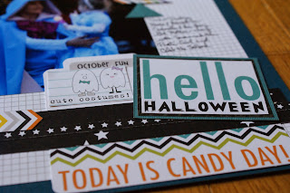
For this layout, I layered a trimmed down sheet of white grid paper from Bella Blvd on top of a blue sheet of plain cardstock.  I used several strips and patterned paper pieces from Bella Blvd's "Trick or Treat" Halloween collection to create layers at the bottom of the page.  Obviously, I did not follow the sketch exactly.  I liked the idea of 4 square photos in the middle of the page - so I focused on that element, cropping my photos to 4x4s and arranging them in the center.  You can see that I also used the layered strips idea, but changed the direction and location of them on the page - mostly because my photos are much larger than what the original sketch called for and the strips would have been lost behind the photos, so I created the cluster of elements to the bottom right.  Additional elements that I pulled from the sketch include the use of triangles (loving them lately) and the chevron element (represented by the colorful chevron borders I fussy cut and the small file "Today is Candy Day" element).  I love how this layout focuses on the photos, yet has plenty of room to highlight awesome papers.  Do you enjoy sketches?  Check out Creative Scrappers - you still have time to join in the fun!

Bella Blvd Layouts

Just finished a couple cute layouts with my Bella Blvd stash!  I'm a sucker for the bright colors and fun patterns, especially in the Daily Chevies and Snapshots collections. Love these "action" photos of Hannah from last summer.  She is always moving!

I found this photo strip from a wedding a couple years ago.  The doodle paper and camera strip complements the silly photo booth strip.  Love this one!


Wednesday, October 2, 2013

My Scrap Happy Craft Room

Do you have a dedicated space to craft? I am so blessed to say, "Yes! I have a craft room!" It makes me super happy. It's purple. It's roomy. My daughter has a little table next to mine. It's the former dining room, so it's just off the kitchen and family area and I can be "in" the mix of the house and not off in some remote corner when I want to craft. I can leave projects out while I'm working on them to take care of other business. I can have a friend or two crafting with me. My craft room is awesome and I am very blessed. Take a peek... what do you think?