Tuesday, September 16, 2014

The Good Stuff

I used Simple Stories for most of these papers and the bingo cards on this layout.  The adorable, big-eyed owls are from Echo Park.  I debated whether or not to scrap these photos, but then I thought that it's these little moments that are unplanned and "un-big" that often bring us the most joy and bond us together as a family.  So here's to celebrating (and documenting) "the good stuff!"

This layout is based on the sketch by Stuck?! Sketches.  They are celebrating some good stuff, too.
You can play along with this sketch (and have a chance at 6 different prizes) until September 29th.

Happy Scrappin'!


Monday, September 15, 2014

Our Family Room Makeover

Tada! We finished our family room makeover.  The last piece to add was the mantel.  Here's a closer view of this gorgeous piece of oak.  Don't you love the saw marks?
If you examine closely, I'm sure you could pick out all kinds of imperfections on this makeover, but we are sure proud of it,  It's hard to believe that we did most everything ourselves and could bring a room from this sad mess:
to this cozy updated gathering place: 
The washed (with tan/white paint + water) brick is such an improvement over the dated red brick.  I think the mantel is so gorgeous!  We had wanted an old beam, but decided to go with an oak beam wrap (budget friendly and much easier to install and handle).  We purchased our beam wrap from Cochran's Lumber in Berryville, VA.  They sawed and put together the white oak so well you really cannot even see the seam on the edges.  We also had them "antique" the wood with the saw marks and other distressing.  As soon as we applied stain, all those character marks and the natural beauty of the wood really stood out.  I love the rich wood against the fresh white.
 The white cabinets, purchased unfinished from Good Wood in Fredericksburg, VA, fit perfectly over the brick and the cupboards provide awesome extra storage.  Media wires are also hidden behind the trim and inside the cupboards. I love how the brick shows through behind the shelving and as soon as we added the trim over the top and wrapped the room in crown, it looked like expensive built-ins.  We pulled the brass insert out of the fireplace and opted for a black screen instead.  It's hard to tell in the photo, but we removed the old nasty carpet and replaced it with light colored hardwood to match the other flooring on our main level.

Here's a few more views of the room and some of the diy projects I made.
My painted striped drop cloth curtains, my family subway art, and my chicken wire photo frame. 
Our gallery wall featuring a set of paintings my husband has had since he was a boy, my monogram canvas, antlers from a deer we harvested, burlap circle frames, my gorgeous canvas family photo.


We are so pleased with how everything came together and can't wait to have friends and family over, decorate for the seasons, and enjoy a weekend without a list of renovation "to-do's".


Thursday, September 11, 2014

Sunshine and Chevrons Painted Sign

Just had to share my new painted sign.  I sing this song to my daughter every night and so it was the perfect sentiment to paint on a sign for her bathroom.  The chevrons were a bit tedious (I used painter's tape to mark them), but I really love the bright yellow background.  I created the word art in Cricut Design Space and cut it out onto tag board to use as a stencil.  I just used acrylic paints, so I'll seal everything with a clear coat of Krylon Acrylic Sealer.  I can't wait to hang it up!

I hope you had a chance to be creative today!

Wednesday, September 10, 2014

Two Page Sketch Challenge


September's Sketch Challenge from DCWV is a two-pager.  Yay!  I love two page spreads and including lots of photos.  Lots of photos on a layout means more story told.  There's still time to play along if you like 2-pagers and are inspired by this fun sketch. Just grab your photos and a stack :) - any stack!

The sketch:

My layout:

For my layout I grabbed The Snapshot Stack.  I snagged this stack on clearance for just $6 a few months ago and hadn't really broke into it, so I decided it was time.  This stack includes lots of little pieces and icons that you can fussy cut and add to your page, like I did.  Our daughter was 4 years old when these photos of her riding her bike were taken, so I was delighted to find a 4 of diamonds card in the stack to incorporate into my page.  For the title, I used a die cut from the Cricut cartridge When I Was a Kid.  I didn't have a 5x7 photo printed, but double matted the focus photo to more closely follow the sketch.  I added a bit of washi tape and used a pen for the border dots.
After taking the photos, I realized I had not yet journaled (gasp)!  Rest assured, I grabbed my black pen and wrote a few lines to tell the story of Hannah's first real bicycle.  I promise ;)


Thanks for checking in - happy scrappin'!

Foxy Card

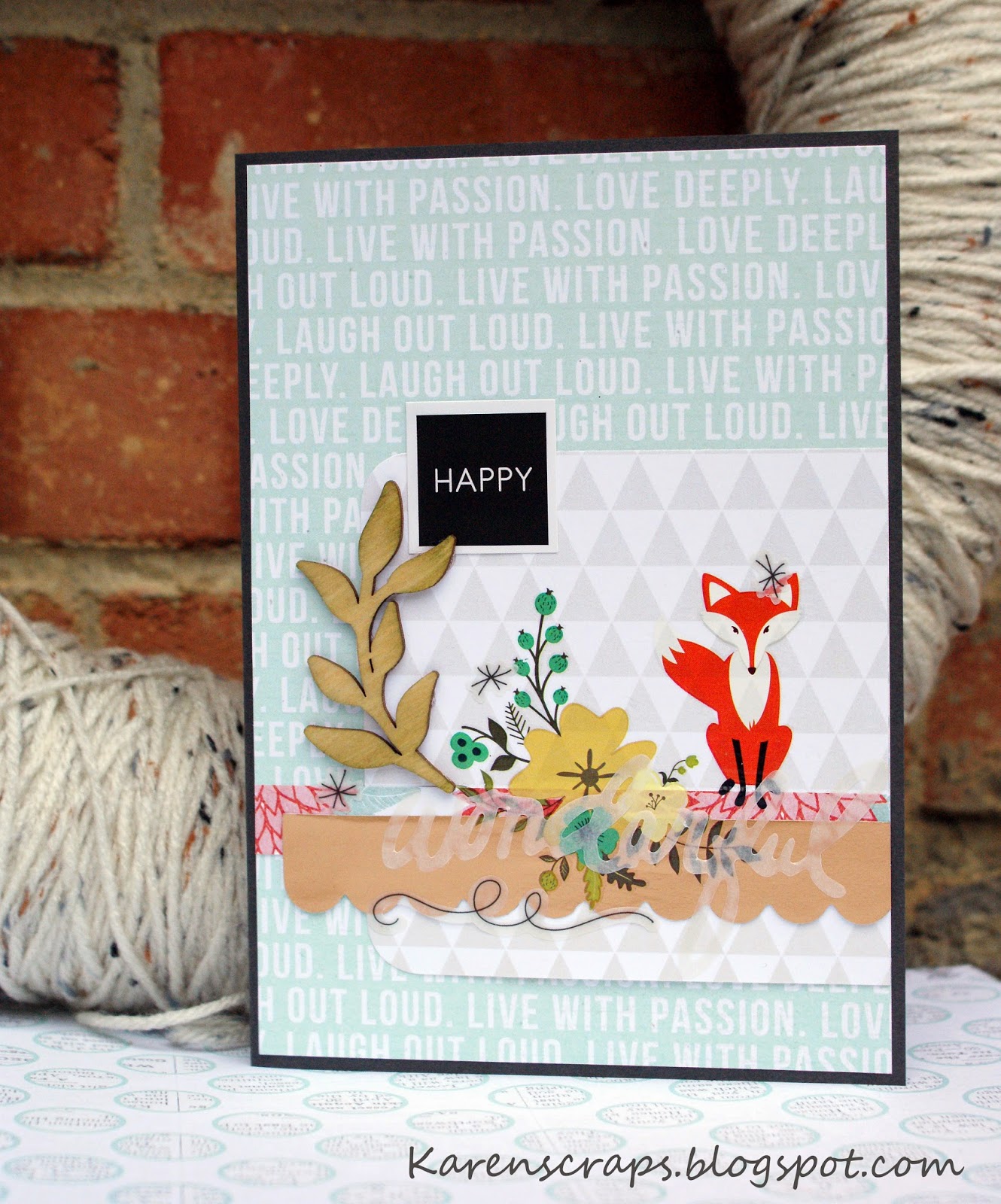
I recently purchased some fun new products from Teresa Collins and got them out for a quick and cute foxy card.  There is actually a mix of products from TC here, including some papers from Something Wonderful, You are My Happy, and a few new things from Nine & Co.  The wood leaf cut, vellum sentiment, and the cute fox are all part of this new collection.  I haven't used rub-ons in awhile and was really pleased with how easily and smoothly these went on.  Hope you are able to create something happy today!